
Build Better Design Systems. In Sync. At Scale.

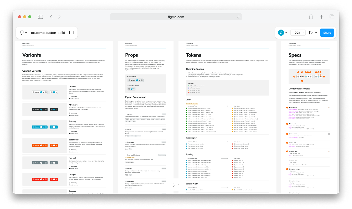
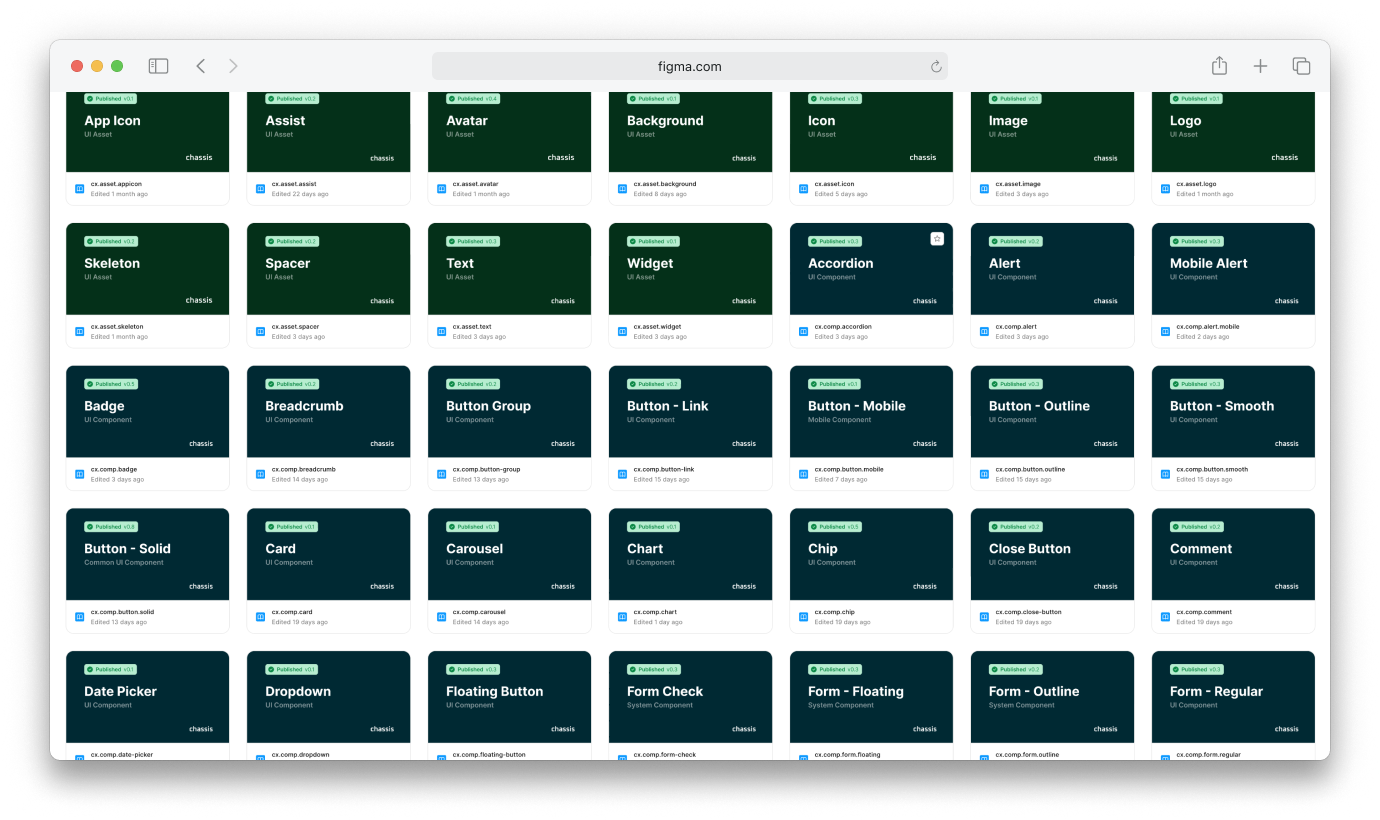
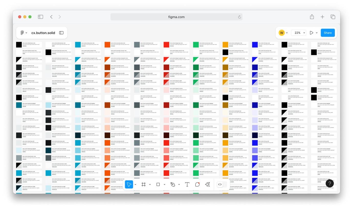
Chassis is the backbone of scalable design systems built for complex, evolving product ecosystems. It unifies Figma components, advanced design tokens, multi-platform transformers, asset libraries, and a fully token-synced CSS framework — all working in harmony across brands, platforms, and products.

Figma Components
Token Library
CSS Framework
Icon Generator
Asset Distributor
AI Integration

Single Source of Truth. Multiple Expressions.

Whether you're shipping a client-facing app, operational tool, or internal dashboard, Chassis helps you centralize and scale design decisions.

Design tokens can be modded per brand, app, or platform — enabling a multi-brand, multi-platform system from a single source of truth.

Strategic Multi-brand Capability

Extend your design system across different brand identities without redundant investment in component rebuilding.

Cross-platform Business Alignment

Deploy uniform design principles to web, mobile, and desktop with platform-appropriate expressions.

Operational Workflow Efficiency

Eliminate costly handoff delays between design and development teams through a shared, automated design language.

// JSON
// tokens/figma/brandA-appA.json
{
  "color": {
    "button": {
      "primary": {
        "bg-hover": {
          "$type": "color",
          "$value": "{color.context.primary.bg-hover}"
        }
      }
    }
  }
}
Chassis UI

Design for the Future in Modularity

Chassis brings a modular, token-first approach to designing in Figma — built to scale and adapt over time. Every component is powered by tokens for color, spacing, typography, and sizing, ensuring future-proof flexibility across brands and platforms.

Chassis UI

Genuine Approach to Color Systems

Semantic color roles allow every brand or app persona to express identity without breaking component structure.

Advanced Typography w/ Responsive Sizing

Typography definitions for key UI elements using consistent tokens. Each font size comes with a specified line height.

Component Dimensions by Design Tokens

Granular tokens for sizing, spacing, and borders ensure components scale responsively and remain visually consistent.

Asset Management for Multi-Brand Design

Eliminate asset duplication and disorganization. Chassis lets you store, manage, and distribute icons, logos, fonts, and illustrations across brands and platforms with ease.

Centralized Library

A single source of truth for all your design assets, ensuring consistency and easy access across teams.

Version Control

Keep track of asset versions and updates, making it easy to manage changes over time.

Cross-Platform Support

Seamlessly integrate assets into web, iOS, Android, and other platforms with built-in support.

Chassis Asset Management Chassis Asset Management
// Source files
  • Assets / default / App A / Icon A.png
  • Assets / default / App A / Icon B.svg
// Distributed files
  • dist / assets / web / brandA-appA / icon-a.png
  • dist / assets / web / brandA-appA / icon-b.svg
  • dist / assets / ios / brandA-appA / IconA.png
  • dist / assets / ios / brandA-appA / IconB.png
  • dist / assets / android / brandA-appA / ic_icon_a.png
  • dist / assets / android / brandA-appA / ic_icon_a.png

Enterprise-Grade Token Management

Chassis provides robust token architecture to manage themes, colors, spacing, and typography at scale. Define, transform, and sync tokens across mobile, web, embedded, and headless platforms.

Hierarchical token structure

Create and modify tokens at global, brand, app, and component levels.

Intelligent references

Build tokens that reference other tokens, enabling cascading updates across your entire system.

Cross-platform transformations

Convert tokens automatically for different platforms while preserving relationships and hierarchy.

Chassis Asset Management
// dist/web/brandA-appA/tokens.scss
$cx-color-button: #000000
// dist/ios/brandA-appA/tokens.swift
@objc public static let CxColorButton = UIColor(red: 1.000, green: 1.000, blue: 1.000, alpha: 0.9)
<!-- dist/android/brandA-appA/tokens.xml -->
<color name="cx_color_button">#ffffffff</color>

Built for Complex Reality, Not Idealized Simplicity

Chassis is designed for the real world of enterprise product development — multiple brands, diverse platforms, distributed teams, and constant evolution. Rather than assuming ideal conditions, it is built for the complexity that successful products inevitably face.

Enter your full name.
We'll never share your email with anyone else.
Enter your company or product name.

What do you need help with?

Enter your message.
// JSON
// tokens/figma/brandA-appA.json
{
  "color": {
    "button": {
      "primary": {
        "bg-hover": {
          "$type": "color",
          "$value": "{color.context.primary.bg-hover}"
        }
      }
    }
  }
}
Chassis UI